Rocky Morphology
Spring 2025 Data Visualization EC Project
Redesign Process
Please feel free to view the milestones of this redesigned interative data visualization here.
Redesign Methodology
My approach to redesigning this visualization focused on making the information more easily digestible, enhancing the communication of the narrative elements in these films in a way that is more visually intuitive for viewers and users, while ensuring it remained feasible within the scope of my current skills and the time available.
Writeup / Critique
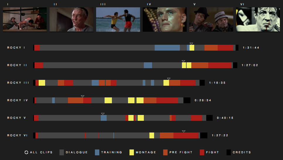
I noticed that the original visualization lacked source material for the data, which I had to compile manually using a text file and then appropriately convert for use in the redesign. What stood out to me most during this process, particularly while breaking down the narrative segments (dialogue, training, montages, pre-fight, fight, and credits), was how misleading the information could be when users interact with the visual. For example, certain segments differentiated by color often overlapped with others they were meant to distinguish from, leading to potential confusion.
Drawing on Donald Norman's guidance on the representation of numbers, I also felt that using Arabic numerals instead of Roman numerals to identify the films would make the visualization more immediately understandable to users. If I had more time, I would incorporate additional interactive features tailored to the data in order to further enhance user experience and comprehension of the visual.
From the redesigned visualization, it's immediately clear that the 'Dialogue' segment consistently dominates the narrative structure and comprises the majority of the runtime across all the films. Another compelling insight revealed through the redesign is the gradual decline in ratings for the sequels over time, except for the final film, Rocky VI, which was surprisingly rated nearly as high as the second installment.
While the redesign is less complex than the original, I believe it is more visually accessible, avoids overwhelming the viewer, and effectively communicates the core information that users are likely seeking. The addition of tooltip-based interactivity allows users to explore further details at their discretion. This revised data visualization aims to present the narrative elements of each Rocky movie in a way that is clear, accessible, and relevant, making it easier for viewers to engage with and interpret the data without unnecessary effort.
Redesign Guidelines:
Choose a published visualization (general media or academic) and redesign it to improve the communication. Include a writeup with your critique of the original and the rationale behind your modifications. Your redesign should be structurally significant, and not merely adding a few labels or touch-ups. Consider: how might you redesign for a different audience? with a more thorough or more descriptive dataset? to prioritize a different message? to change the narrative structure? Make sure you read Design and Redesign in Data Visualization by Viegas & Wattenberg, 2015 before you start. You're welcome to use any software tool you like.
References: