Welcome, my name is Edward Yi.

Creative User Interface/Experience Tactician

edward profile image

I am a Computer Science and East Asian Studies student at Columbia University in the City of New York, and I am excited to exercise my creavity through technology to create the greatest experiences possible.

Click here to learn more About Me.

Featured Project: CU Eats

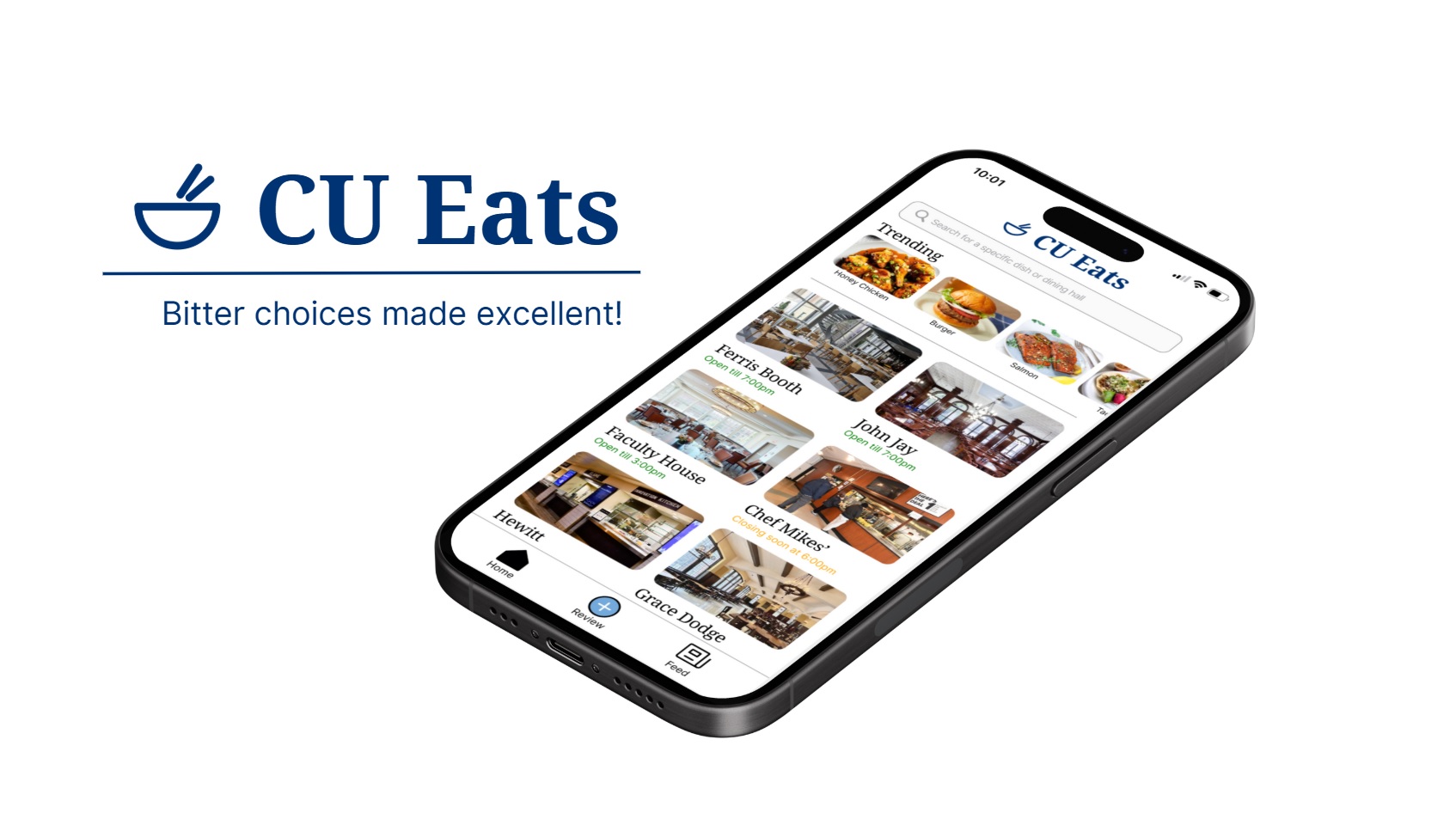
CU Eats stock image

Fall 2024 UX/UI Design Project

Theme: Social Good on Campus

Problem Statement: I often find it difficult to choose which dining hall or dish to eat at on campus.

While the menu showcases available dishes, it doesn't provide any feedback on taste, quality, or overall appeal, leaving me unsure whether the meal will meet my expectations, or taste good or not. To get more information on a dish, I mostly rely on my friends' recommendations to guide my choices. I wish there was a centralized source to help me make informed decisions based on community feedback, enhancing my overall dining hall experience.

Our most promising design solution is a platform for a user interface that acts as a menu display for the dining halls at Columbia University and a database for reviews of certain dishes at the dining halls.

The Design Process

Understanding Users

To better understand our target population and the current issues with the dining experience at Columbia (as stated in the problem statement), we conducted a contextual inquiry by observing and interviewing 4+ different people.

From this set of interviews, we learned/verified that:

1. The dining hall website isn't up to date or necessarily accurate.

2. Separate Barnard/Columbia websites are cumbersome to navigate.

3. When trying to decide what dining hall to go to, the current interface can lack accurate and useful information (this includes food currently being served, menu options, dietary restrictions, quality of food, wait times, crowdedness).

4. There is not an effective way to communicate with students about the current dining hall food or its capacity.

5. The current dining hall interface is buggy.

Our contextual inquiry notes can be reviewed here.

Affinity Diagram

Affinity Diagram

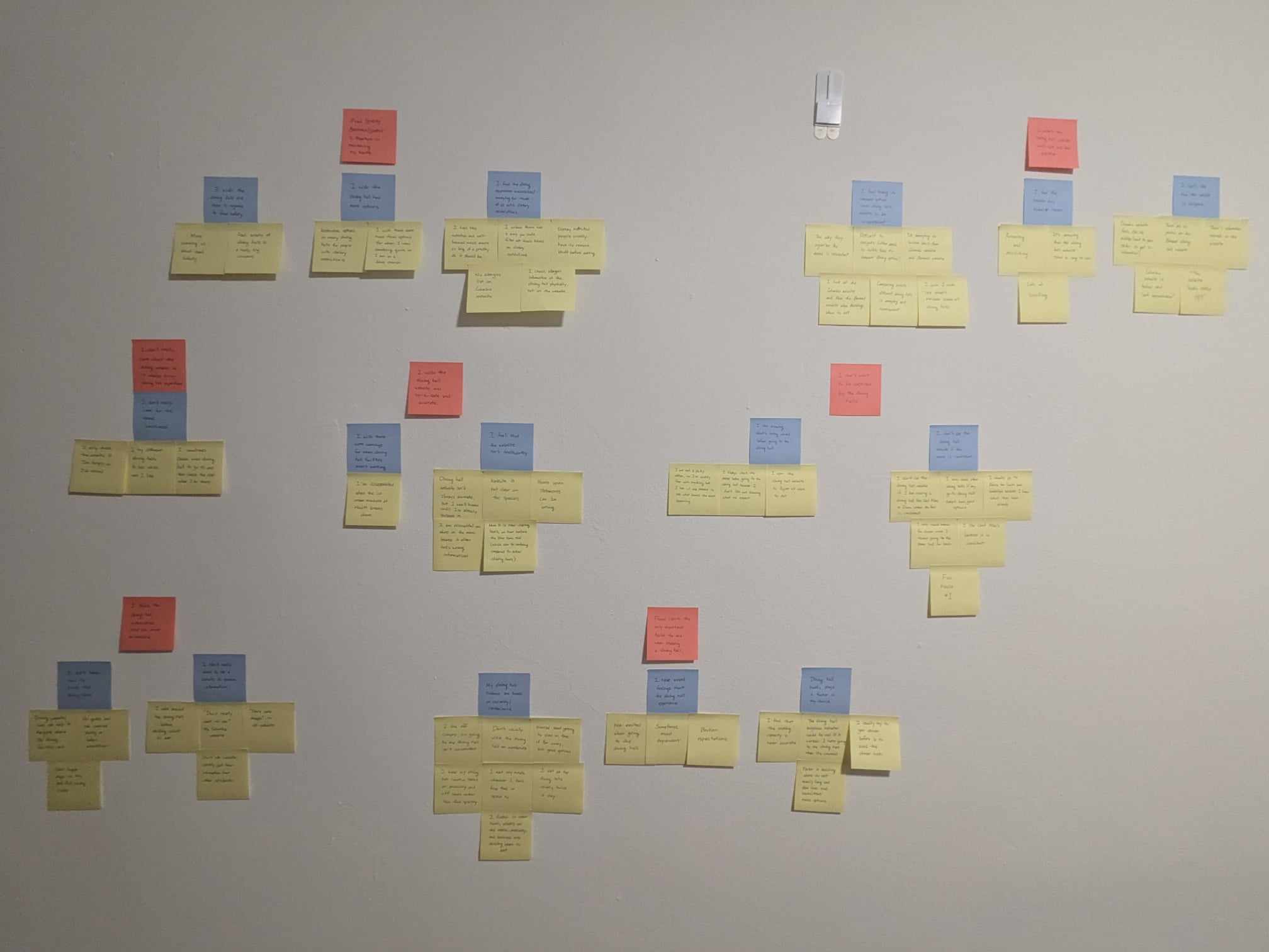
Utilizing the data we collected from the contextual inquiry, my team and I organized an affinity diagram to synthesize all our findings into broader common themes.

We started this process by noting down all our general findings and comments made by our participants during our observations and interviews on the yellow post-it notes.

Then we grouped them into categories and wrote a summary label for each cluster on the blue post-its.

From there, we grouped those clusters into broader common themes and labeled each one on the red post-its.

To take a closer look at the affinity diagram and experience a digital 'wall walk', click here.

Journey Mapping

Journey Map

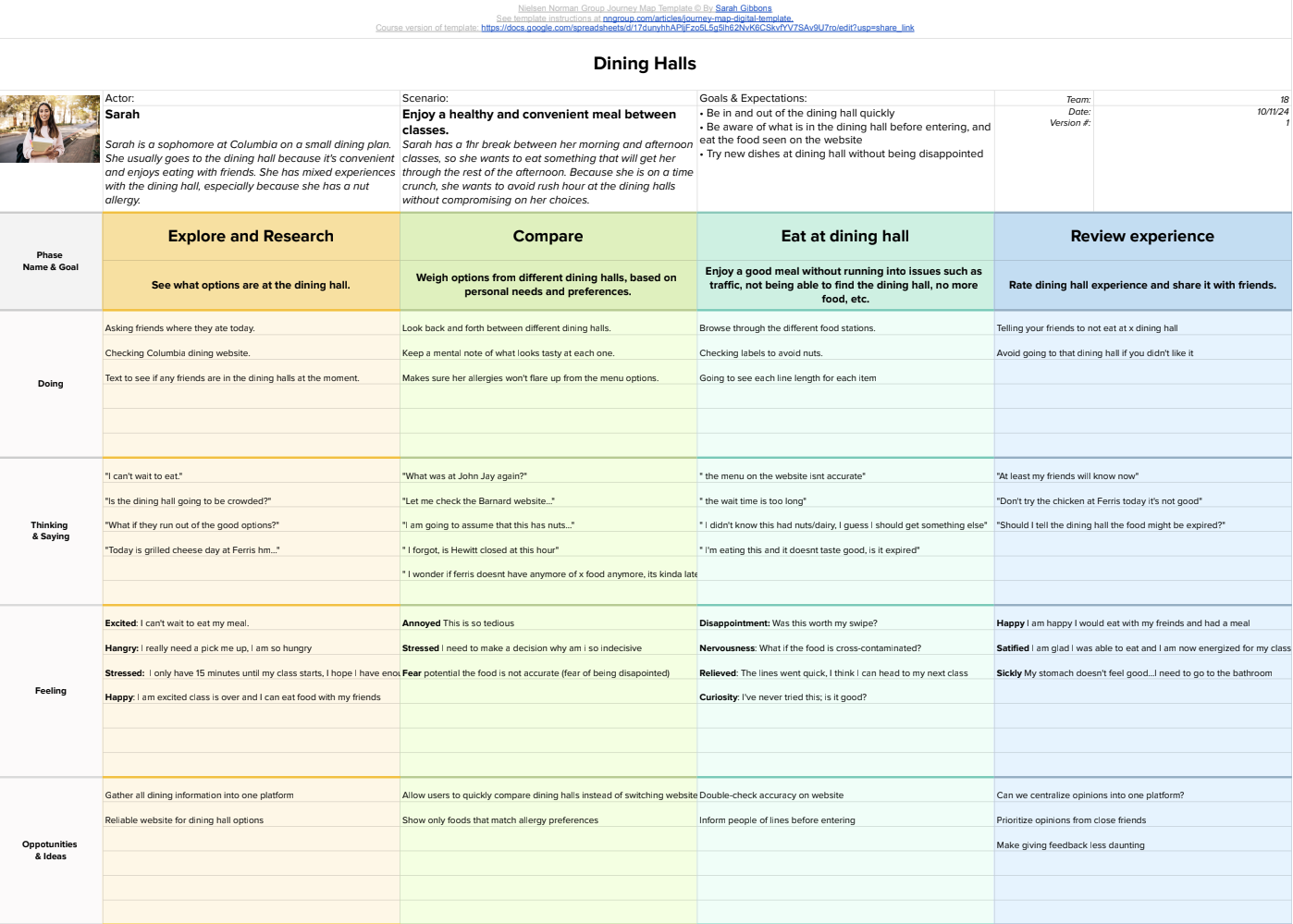
Although screens show what the user sees, they cannot show what the user thinks or feels. In other words, screens don't tell the story. Humans are wired to make sense of the world through stories.

In this phase of our project, we created a journey map to tell the story by highlighting key moments (highest point, lowest point, and major transitions) to guide us in getting the right design for our design solution.

Our journey map illustrates the user's entire experience in a simple, actionable chart and identifies the most promising opportunities to improve the user's journey.

To take a closer look at our detailed journey map spreadsheet, click here.

Storyboard

Storyboard

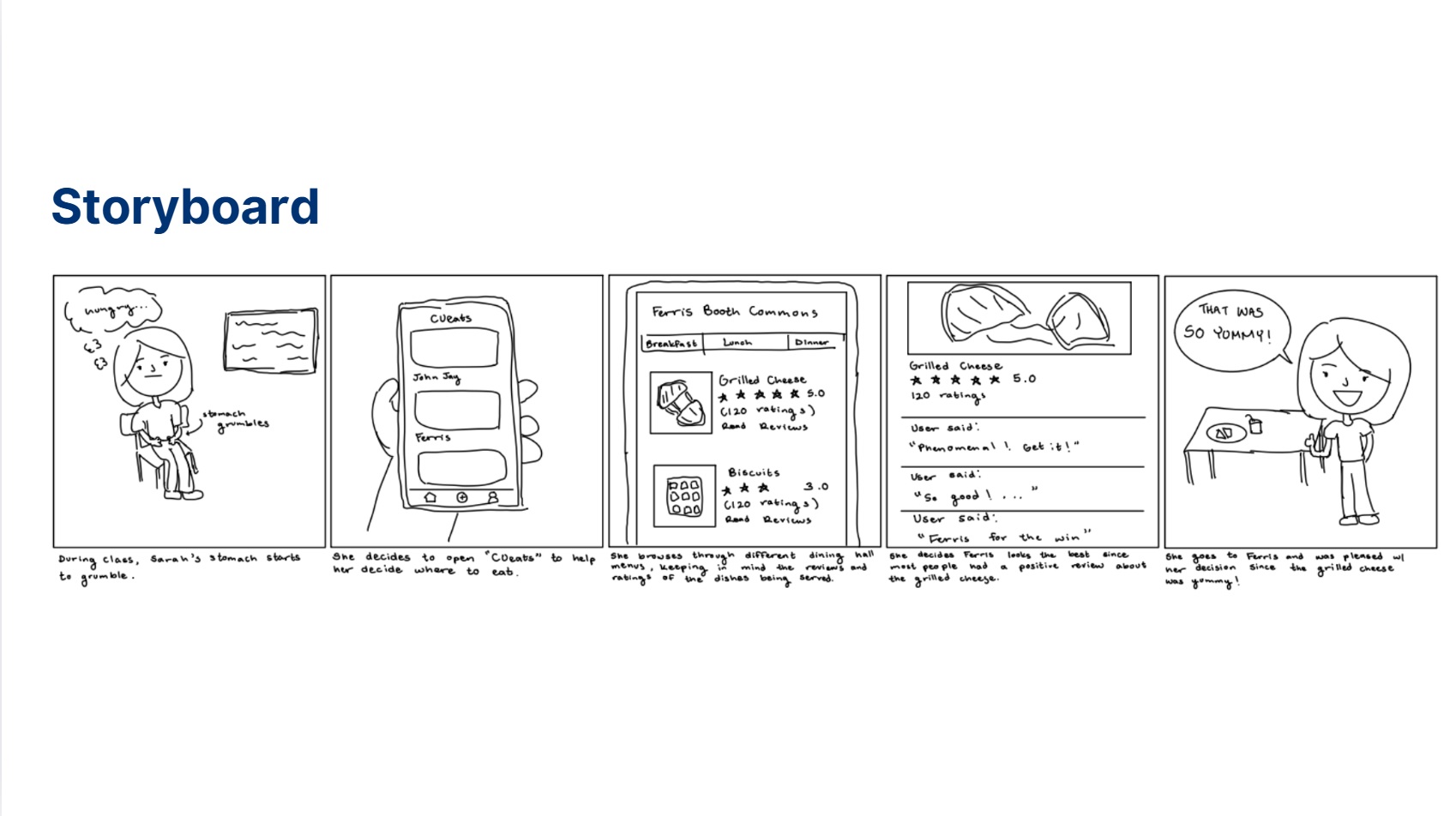
To brainstorm different design solutions or 'hills' to address our problem statement, every team member illustrated a different storyboard.

Storyboards are what allow us to communicate design ideas in a simple and engaging way. But unlike journey maps, storyboards shine when illustrating a solution concept (not just a status quo experience).

The storyboard above/on the left is the latest idea that most closely emulates our design solution for the final product: an interface that acts as a menu display for the dining halls at Columbia and a database for reviews of certain dishes at the dining halls.

All of our team's storyboards can be viewed here.

Smoke-and-Mirrors Prototyping

Smoke-and-Mirrors

At this stage, we are testing a solution concept ('hill') in a quick and effective manner through a smoke-and mirrors prototype.

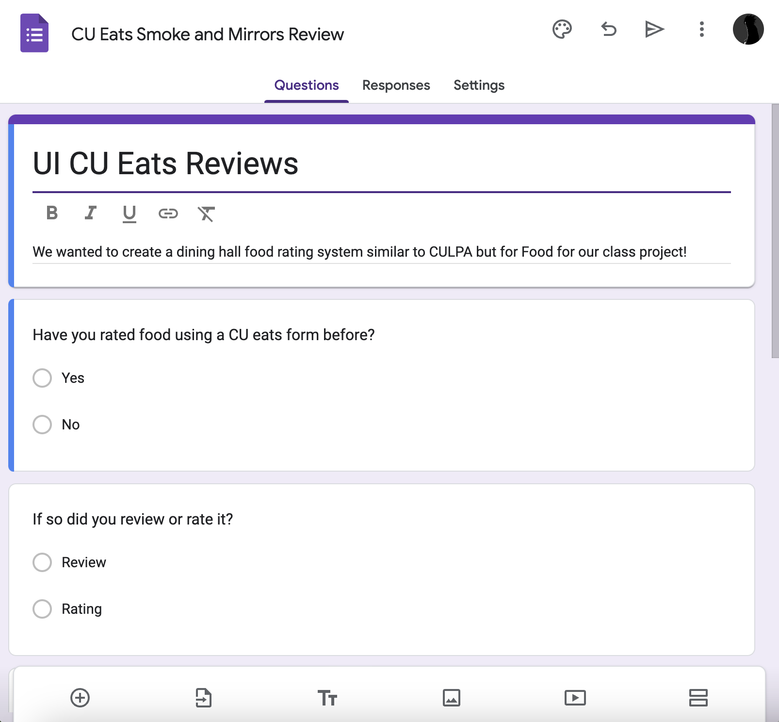
When testing our solution concept, our team wanted to mainly focus on determining whether users would actually provide data for Columbia dining hall dishes with star reviews and ratings, and whether they would find the information we compiled from these responses useful.

Our team collected reviews and dining information using a Google Form, which we used to populate our “database” of dining hall reviews. To gather a large amount of data, we printed and posted flyers around campus, particularly in areas near the dining halls. We also promoted CU Eats by sharing the Google Form in group chats and directly messaging individual users.

Please refer to the checkpoint summary document for a comprehensive report of our smoke-and-mirrors prototype concept test, evaluation, and takeaways.

Our smoke-and-mirrors evaluation and study data can be reviewed here.

Low-Fidelity Prototyping

Low-Fidelity Mockups

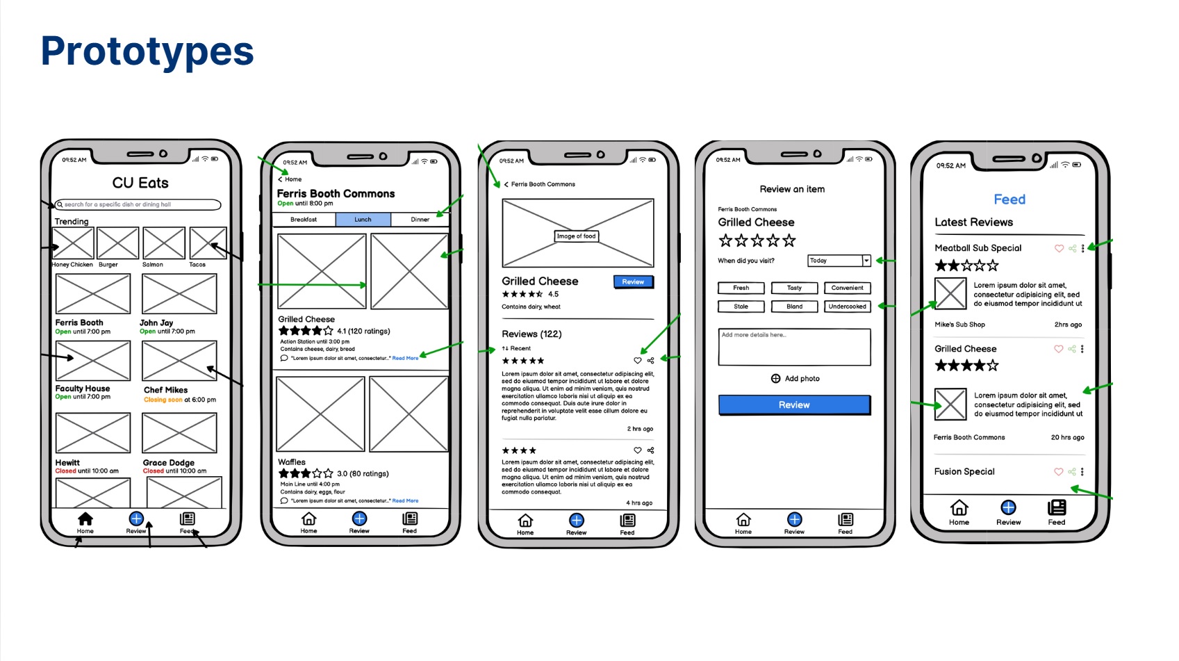
We created low-fidelity prototypes to test basic functionality and gather initial user feedback.

This helped us refine our approach before moving on to more refined (high-fidelity) designs.

All of our Basalmiq lo-fi prototypes can be reviewed here.

Read more on our design choices for these prototypes here.

User Evaluation

User Evaluation

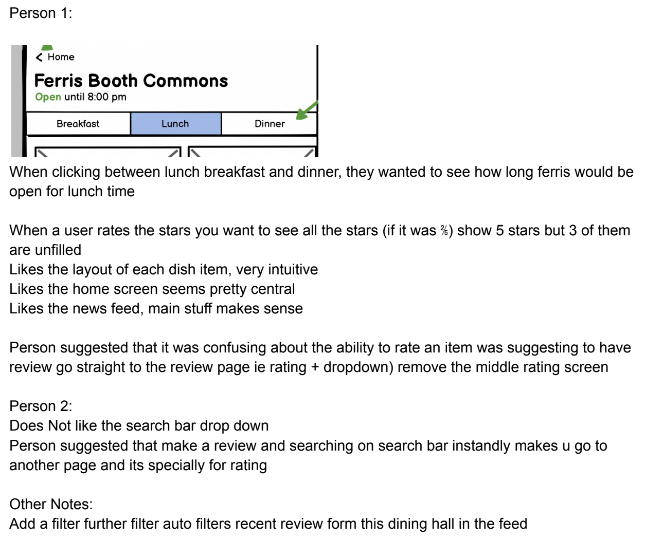
Our team conducted a user evaluation, selecting 2 participants who volunteered from our smoke-and-mirrors prototyping to continue serving in our test group for evaluating our latest, more refined prototypes.

With minimal information and direction, these users were asked to navigate our app screens and provide feedback after exploring our low-fidelity prototypes.

Utilizing the feedback received during the user testing phase, we had the opportunity to further refine our prototypes in preparation for creating high-fidelity prototypes in Figma.

Read more about our user study, feedback, and takeaways here.

High-Fidelity Prototyping

High-Fidelity Mockup

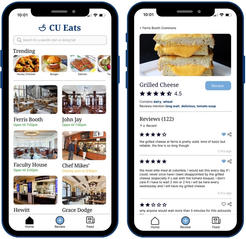
We developed high-fidelity prototypes incorporating the feedback that was received from user testing.

These prototypes included more detailed visual elements and functionality, providing a clearer representation of the final product.

All of our Figma hi-fi prototype designs can be reviewed here.

Please feel free to also explore our prototypes directly in Figma here.

Final Product

With the help of CU Eats, we want to provide users more transparency and give them a sense of agency when it comes to the food they choose to consume at dining halls.

Eating at Columbia University has never been made more simple.

CU Eats, bitter choices made excellent.

See the code to our final design solution here, and feel free to watch our team's project video below.